Theming & UI Customization
The Web Low-Code SDK supports visual customization through the IDV Backoffice, where each integration can be styled to match your brand identity. These theme settings are configured centrally and are automatically applied when the SDK loads the corresponding flow.
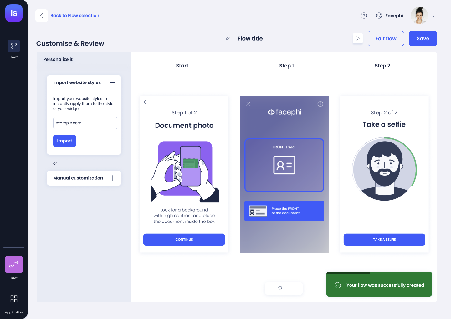
Theme Configuration in the Backoffice
When creating or editing a Web Low-Code integration in the IDV Backoffice, the following visual parameters can be defined:
- Primary Color (
primaryColor): Main color used for buttons and highlights. - Secondary Color (
secondaryColor): Used for secondary UI elements and interactions. - Tertiary Color (
tertiaryColor): Used in backgrounds or alternate actions. - Background Color (
backgroundColor): Sets the main screen or wrapper background. - Font Name (
fontName): Custom font applied across all UI components. - Logo URL (
logo): Displays your brand’s logo at the top of the flow.
These parameters are defined via:
{
  primaryColor: response.theme.colors?.primary,
  secondaryColor: response.theme.colors?.secondary,
  tertiaryColor: response.theme.colors?.tertiary,
  backgroundColor: response.theme.colors?.backgroundColor,
  fontName: response.theme.font,
  logo: response.theme.logoUrl,
}
Applying the Theme
Once configured, the SDK will automatically fetch and apply the theme settings when rendering the flow. No additional code or styling is required on the frontend.
🎨 The theme applies globally across all steps in the flow, ensuring a consistent and branded user experience.
Responsive Design
The SDK UI components are fully responsive, working seamlessly across:
- Mobile browsers
- Embedded WebViews
- Desktop and tablet screens
By leveraging the centralized theming system, teams can deliver branded identity verification flows without maintaining separate CSS or UI logic.